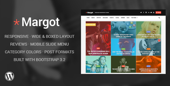
Margot – Responsive WordPress News Theme (Blog / Magazine)

Margot is a fully responsive WordPress theme designed for magazine and news website.


Key Features
- Responsive Design
- Wide and Boxed Layout
- Reviews System
- Retina Font Icons
- Mobile Slide Menu
- Customizable Main Color
- Popular Posts Widget
- Theme Options Panel
- Facebook and WordPress Comments
- Custom Background
- WordPress Shortcodes
- Social Buttons
- Multi-Level Drop-Down Menu
- Responsive video widget
- Full-Width Template for Pages and Posts
- Facebook Like Box Widget
- Bootstrap Framework 3.2
- Translation Ready
- SEO Friendly
- Documentation With Screenshots
Credits
- Bootstrap Framework
- Owl Carousel
- Infinite Scroll
- IcoMoon Icons
- Quick Flickr Widget
- jQuery,
Superfish Menu,
FitVids.js,
Retina.js,
Knob,
dotdotdot,
Sidr
Photos used in preview are licensed from Photodune and not included in the theme.
Changelog
=== v1.3 - September 1, 2014 ===
+ Tested with WordPress 4.0
+ Minor improvement to the Tag Cloud widget (css/main.css)
+ Fixes to the featured area and metaboxes (content-featured.php, inc/metabox.php)

=== v1.2 - August 25, 2014 ===
+ Added new Vimeo icon (inc/template-tags.php, options.php, css/main.css)
+ Added new thumbnail size to the "Big Image" posts (content-poster.php, css/responsive.css)
+ Fixed the option to disable the color overlay (inc/stylevar.php)
+ Improved the review box (css/responsive.css)
+ Improved the search bar (header.php, js/init.js, css/main.css, css/responsive.css)
+ Minor style improvements (css/main.css, css/lib.css)

=== v1.1 - August 12, 2014 ===
+ Initial Release
Tags: Blogging, bootstrap, boxed, color, creative, flat, gallery, Infinite Scrolling, magazine, modern, news, reviews, slide menu, wide, widgetized

